
Ibrox View: Rangers enduring fan pile-on but we think updated crest is spot-on

Updating the club crest is always going to open you up to criticism.
People don’t like change at the best of times and the crest is a very emotive subject – for all football fans, not just for Rangers.
So, perhaps it was unsurprising that Rangers fans have mostly piled onto the new crest announcement, trailed by hall of famer John Grieg.
In a Twitter reveal on Wednesday Grieg said, “For generations, the Ready crest has defined our ambition. An icon of excellence. To win we must keep moving forward & so we bring the next chapter.”
The reaction was swift and pretty brutal from a lot of fans – this one wasn’t too far off the mean.
However, not all fans were so resistant to change – and we’re among them.
Let’s have a look at the old and new crest side-by-side.
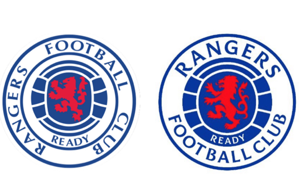
Now, this is obviously going to come down to personal taste but we’re immediately drawn to the updated crest.
But, to be honest, there’s not a huge amount of difference between the two.
The new crest on the right has a centred ‘Rangers’ and a sharper ‘Ready’ and lion motif.
It looks cleaner and more modern – it’s basically a freshening up rather than a full update. It holds onto the tradition but takes a small step forward.
Our only criticism – and it’s a minor one – is the difference in weight in the font between ‘Rangers’ and ‘Football club’.
We understand why it’s been done but we’d have preferred the words to be in the same weight.
Aside from that, we think it’s spot on and we think that the bulk of fans will come round once they’ve got used to the idea of change.
Well, maybe not everyone – the fan above who accused the designer of being a Celtic supporter might stick to his guns.
In other Rangers news, Ibrox View: Rangers could get 20/21 boost after transfer reports on rival striker